Aug 19, 2011

Ohiki explorations …


I really enjoyed getting to revisit Samurai Cluck after a year or so away from him. I think I'm gonna do something with him soon, so I spent some time working on design options.

What it do?

Aug 16, 2011

Silence before the storm…


And in that moment, he knew the end of all things would find him. Eyes narrowed, he would destroy the world.

Decided to finish my late night doodle over lunch today. I haven't drawn Cluck in so long. Of course, the constant noise the roosters make out in the yard is inspiration enough.

You haven't seen a bro-fight til you've seen two roosters fighting over a hen. Popped collars indeed.

Aug 5, 2011

The Great Dribbble Debate … Part Two

Having used Dunk for a week, I decided I was still curious enough to check out Travveling. While there are similarities between the two apps, Travveling does a couple things better. Again, keep in my that I am not a developer. I am only looking at this from a designer's perspective.

Where'd I put my meth lab?
The first noticeable difference is the layout. Travveling is a predominantly vertical app. Compared to Dunk's opening screen, this is a definite change in directions. After all, you can buy drugs here! All kidding aside, it'd be nice to see something awesome from the developer that really dots the ' i ' so to speak.

Informative and delicious.
The main feed is straightforward with a couple of nice additions. The ability to pull just My Likes was a great touch. After all, if I liked it, I'd love to be able to show my friends without digging through everything to get to it. I also appreciate being able to search by username. I can type in "inkstatic" and it bring up a page of my shots.

Moar gridz plz.
Here, I just the chose Popular feed and began browsing through a plethora of shots. I have a weakness for grids and the thumbnail gallery makes browsing a joy as I can scan through more pics and really zero in on the ones I want. I tap on a shot I want to see more of and we move into muddier waters.

Click it. Swipe it. Love it.
Back to my favorite banana themed logo of the year. The vertical layout feels slightly off due to the 4:3 ratio that Dribbble restricts shots to. It's nothing overly unsettling, and the developer took advantage of this opportunity to add in browsing buttons. However, I'm a swiper from way back and I continued unabated. I click on the icon in the upper right corner for more info.

Why hello! I'm a useful page.
I arrive at an attractive page that allows me to do much what you'd expect. I can view comments, check out the player's other shots or share this shot on a variety of different media (and by variety, I mean everything you can imagine.) I can't view Player info though - it seems I can only view shots by Players. My favorite feature by far is shown below.

Simply tap the shot …
And you can view it on Dribbble.
This is the feature I was hoping Dunk would have. I can view the shot on Dribbble with no fuss and I can save it to my iPhone. That's a pretty sweet deal. The in-app Dribbble browser is very much the same as others you have probably seen. It's clean and  unobtrusive which works well. So far, this is a pretty good app. It works well, the thumbnail feed is really well done. So what did I mean by 'muddier waters'?

Oh man! I can rotate this?
Oh yeah, that's nice … 
Uh oh, it's broke. Maybe I'll rotate it back …
Oh. That doesn't fix the issue.
Travveling breaks every time I rotate the iPhone horizontally to get a better look at a shot. As long as it stays vertical, there is no problem drilling down into a shot to get more info, view comments or view it on Dribbble. However, once horizontal, the layout gets wonky. Things start overlapping where they shouldn't, which is no bueno. If I back out, and rotate back to vertical, no problems. But that means never rotating my phone to see these shots at full size. Which stinks.

This is a good app, but the horizontal / vertical layout issues keep it from being great.

Pros 
  • Easy browsing. 
  • Intuitive UI - buttons are just where you need em. 
  • Thumbnail feeds are where it's at.
  • Users can save shots.

Cons
  • The rotation issues are a huge deal breaker for me. I like big, beautiful images.
  • No player info. This app is focused entirely on shots, which isn't a bad thing for everyone - but it is for me.
Meh
  • Couldn't find a settings button. Regardless of what it does, I like having one in every app I own simply so I can see what kind of control I have over certain aspects of it. Sometimes it's how I discover things about the app.
Is Travveling worth your time? Yes. Overall I'd say this app earns a C+. It has two of the features I really wanted when I used Dunk, however, Dunk allows me to really find out more about a player, such as follow them on Twitter or view their draftees. It's closer to the actual Dribbble experience than Travveling is at this time.

So what's the final verdict?

I'll be sticking to Dunk for the time being.  If they could add in a thumbnail feed, I could live without saving shots to my iPhone. Even my complaint about the View On Dribbble button being buried in comments simply means an extra tap of my finger. 

Even though Travveling has a great foundation to build on, the rotation issues and lack of player information prevent me from enjoying my experience on the app as much as I'd like to. If the dev team can address the key issues I have, I'd definitely come back to it.

The Great Dribbble Debate … Part One

I recently started searching for a Dribbble app to keep me up to date on my favorite peeps. Dribbble doesn't have an official app and I'm not entirely sure what the API is capable of. I'm no developer. I am however, a designer and this review should be read with that firmly in mind.

I tried the 2 most popular apps I found - Dunk and Travveling.

First up, Dunk:

Awwwww yeah. I gots my chrome on.
Dunk is the first app I test drove. It features an exclusive horizontal layout. Everything you view is inherently at full size. This was very nice because it put me straight into the feeds. I didn't have to tap to zoom or rotate my iPhone to get a better view. While slightly awkward at first, I quickly became accustomed to holding my iPhone this way.

Feed me Seymour!
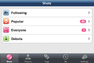
The main feed screen is pretty straightforward. I can view the people I'm following easily. I can also get into other feeds I'm not subscribed to. The Tag feature is nice and the Player feature is neat. I say neat because it's not entirely useful - it's like creating a bucket with just one person. Seeing as how I spend most of my time viewing Dribbble on my Mac, it didn't appeal to me.

Swiping the screen.

Tapping the top of the screen.

This is obviously the bottom!
Diving right in I can swipe through the shots easily. Dunk does a really great job at using touch technology. As I swipe the screen, the Name and Designer pop up. If I tap the top, a navigation bar pops up letting me know where I am and how I can get back home. If I tap the bottom, the stats for the shot appear. This is really intuitive and easy to use. Big beautiful pictures and easy to understand buttons. Speaking of buttons …

I'm gonna look at your shots AND your followers.
If I want to view the Player who posted the shot, I tap the basketball player icon. This brings to me to this screen here. I can add them to my Dunk feeds, I can view their Likes or their shots. Tapping Back just does that. Back to the shot I go. If you want to view more about this person on the Dribbble browser, just tap on Shots, Likes, Following etc. It will open up and take you there.

Comments and faves in one spot. Who knew?
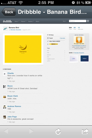
This is where Dunk loses some steam. If I want to view the comments, I obviously tap the comment icon. However, there's another purpose. If I want to fave this shot, I also have to do that through here. Clicking on View On Dribbble opens up an in-app browser of the shot in Dribbble. You can sign in here and do whatever it is you do on the actual site.

Where the magic finally happens. Fav'd.
Tapping the little X in the left corner closes the browser and takes you back to the shot. You can share this link or refresh the page, but that's about all it offers.

All in all it's a decent app. It's not bad, but it's not great. It doesn't wow the user.

Pros 
  • Easy browsing. 
  • Mostly intuitive interface. 
  • No bugs, glitches or issues I could find.

Cons
  • Needs a View On Dribble button on the shot itself - the comments area isn't the most obvious place in the world for those who are looking to add it as a favorite. 
  • There are no thumbnail pages - you have to scroll through every single shot in a feed. 
  • It hangs something fierce when you're not on a wifi network - Dunk seems to have issues processing the feed without the net to back it up.

Meh
  • Couldn't find a way to save shots to my iPhone.
Does Dunk make the cut? Yes. Overall I'd say this app earns a B+. It's slightly above average, but has room for improvement.

Up next, Travveling gets a lookin' at.

Jun 24, 2011

The A's for awesome…

What's that Cap? I should update my blog once in a blue moon? You always give the best advice.

Mar 20, 2011

You shall not pass…


… into vector just yet. Until you've drawn it all out by hand. This is a quick snapshot for a presentation I'll be doing up at UCO for the students in the coming weeks. We'll be talking about mascots and vectors. But it's boring to use a school that everybody already knows.

So I decided The Arnorian School of Wizardry for Arts and Lore needed a mascot for their athletic department, The Grey Pilgrims.

Lineart and color explorations in Photoshop. I'll build it out later in Illustrator and craft a type treatment.